
Match your booking page to your brand with custom CSS
A new TimePlan booking page uses the default service colours. If your company already has a logo, colour palette and website, you can style the booking page to match.
The custom CSS field lets you change colours, unavailable-time backgrounds, form fields and buttons on both desktop and mobile booking pages.
We will restyle a Pilates calendar in a calm green palette in three steps. You can copy the CSS as it is; changing the four colour values at the start gives it your own palette.
1. The result
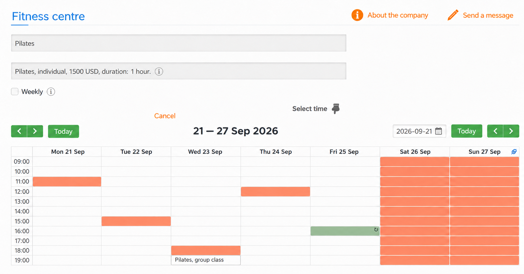
Before customisation:
After customisation:
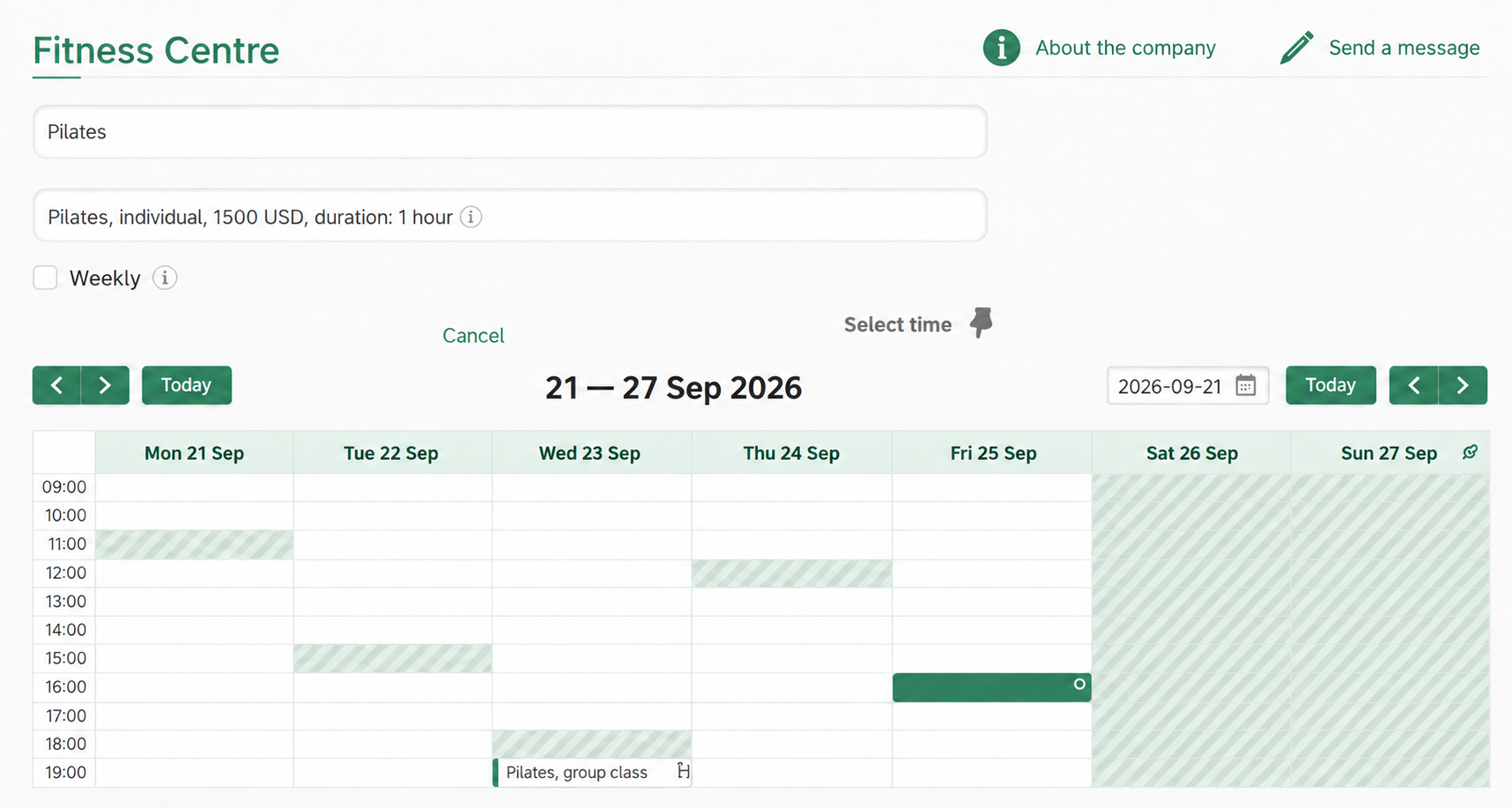
The changes include brand colours for headings, links, icons and buttons; subtle hatching for unavailable times; a lightly tinted calendar header; white selection fields with thin borders and rounded corners; and a coloured left border for group classes.
The mobile page uses the same stylesheet.
2. Where to add CSS
Open Integration → Appearance customisation. The page contains a CSS stylesheet field and a Save button.
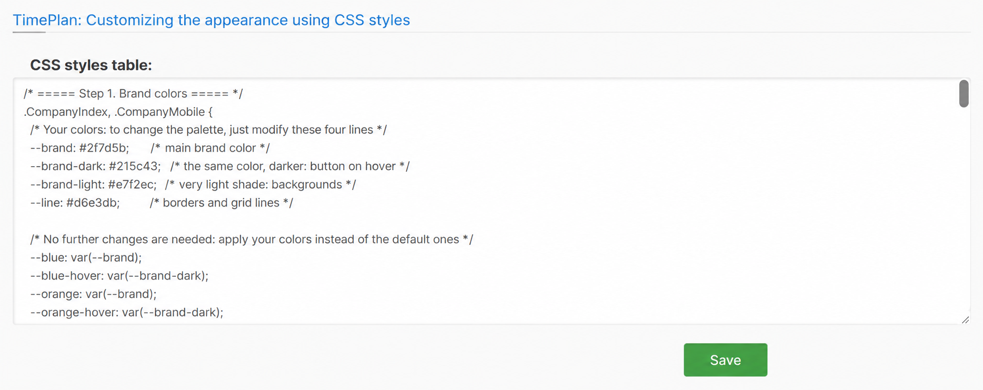
- Paste your CSS into the field.
- Click Save.
- Open the booking page in another tab and refresh it.
Changes apply immediately. Parent classes let you target particular pages:
| Page | Class |
|---|---|
| Full booking page, including an embedded website widget | .CompanyIndex |
| Mobile booking page | .CompanyMobile |
| Administrator's My Calendar | .Timetables |
This example uses .CompanyIndex and .CompanyMobile to target client pages.
3. Step 1: brand colours
Paste this first block and save:
.CompanyIndex, .CompanyMobile {

  --brand: #2f7d5b;
  --brand-dark: #215c43;
  --brand-light: #e7f2ec;
  --line: #d6e3db;


  --blue: var(--brand);
  --blue-hover: var(--brand-dark);
  --orange: var(--brand);
  --orange-hover: var(--brand-dark);
  --dark-orange: var(--brand);
  --green: var(--brand);
  --green-hover: var(--brand-dark);
  --btn-success-hover: var(--brand-dark);
}
The four custom variables are:
--brand: the main brand colour;--brand-dark: a darker shade for hover and active states;--brand-light: a very pale background tint;--line: borders and calendar grid lines.
The remaining declarations substitute those values for the default interface colours.
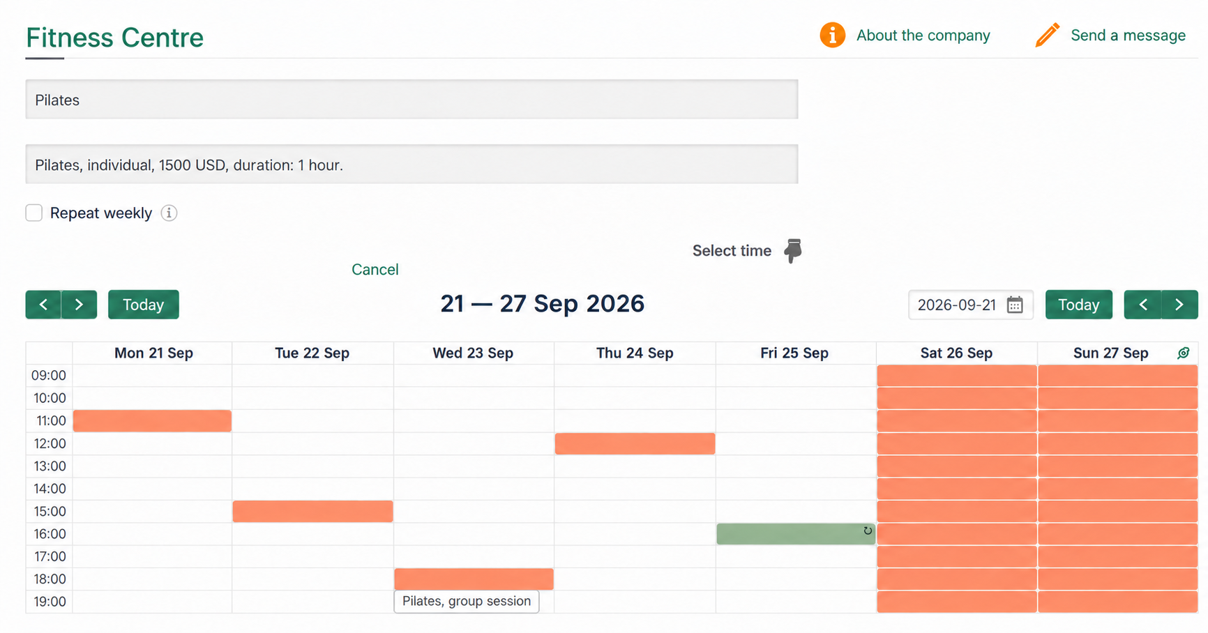
Headings, links and navigation buttons now use the new colours. The next block styles unavailable calendar cells.
4. Step 2: the calendar
Add this after the first block:
.CompanyIndex .EventTypeBusy,
.CompanyIndex .EventTypeOffHours {
  background: repeating-linear-gradient(135deg, var(--brand-light) 0 6px, var(--line) 6px 12px) !important;
  border-color: var(--line) !important;
}


.CompanyIndex .EventTypeBusy[style*="140, 179, 140"] {
  background: var(--brand) !important;
  border-color: var(--brand) !important;
}

.CompanyIndex .EventTypeBusy[style*="140, 179, 140"] .SeriesMarker {
  color: #fff;
}


.CompanyIndex .EventTypeGroup {
  background: #fff !important;
  border: 1px solid var(--line) !important;
  border-left: 4px solid var(--brand) !important;
}


.CompanyIndex .fc-day-header {
  background: var(--brand-light);
  color: var(--brand-dark);
  padding: 6px 0 !important;
}


.CompanyIndex .fc-view-container {
  background: #fff;
}

.CompanyIndex .fc td,
.CompanyIndex .fc th {
  border-color: var(--line) !important;
}
Busy and non-working times get light diagonal hatching. It distinguishes unavailable slots while keeping the open times easy to see.
The client's own bookings use the main brand colour.
The selector containing style*="140, 179, 140" finds these bookings by their existing inline colour, because there is no separate class for them. It replaces that colour with --brand.
Group classes stay white with a coloured left border.
The !important declarations are deliberate: some calendar colours are applied directly to page elements and need to be overridden.
5. Step 3: fields, buttons and finishing touches
Append this final block:
.CompanyIndex .select2-container .select2-selection--single,
.CompanyMobile .select2-container .select2-selection--single {
  background: #fff !important;
  border: 1px solid var(--line) !important;
  border-radius: 10px !important;
}

.CompanyIndex .select2-container .select2-selection--single .select2-selection__rendered,
.CompanyMobile .select2-container .select2-selection--single .select2-selection__rendered {
  background: transparent !important;
  box-shadow: none !important;
}

.CompanyMobile .select2-container .select2-selection__arrow {
  background: transparent !important;
  border: none !important;
}

.CompanyMobile .form-DatePickerWrapper .form-control,
.CompanyMobile .form-DatePickerWrapper .input-group-addon {
  background: #fff !important;
  border: 1px solid var(--line) !important;
}


.CompanyIndex .btn,
.CompanyMobile .btn {
  border-radius: 10px !important;
}


.CompanyIndex .booking-action svg path {
  fill: var(--brand) !important;
}


.CompanyMobile .booking-title,
.CompanyIndex .modal-header .title {
  color: var(--brand) !important;
}


.CompanyIndex .title-box::before {
  background: var(--brand);
}


.CompanyIndex input[type=checkbox],
.CompanyMobile input[type=checkbox] {
  accent-color: var(--brand);
}
It styles selection fields, borders, buttons, icons and headings. Save and refresh the booking page to see the complete result.
6. The mobile booking page
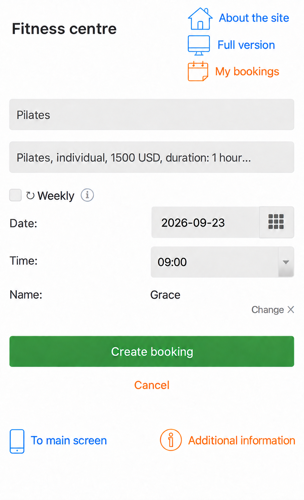
On a phone, clients choose a service, date and time in a compact form instead of a large weekly grid. The colours, fields and buttons use the same CSS.
Before:
After:
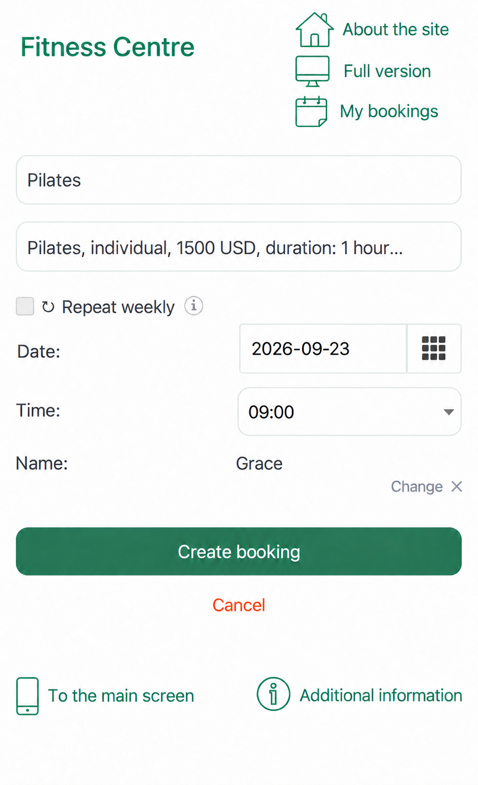
The company name, links, icons, fields and Create booking button now share the desktop page style.
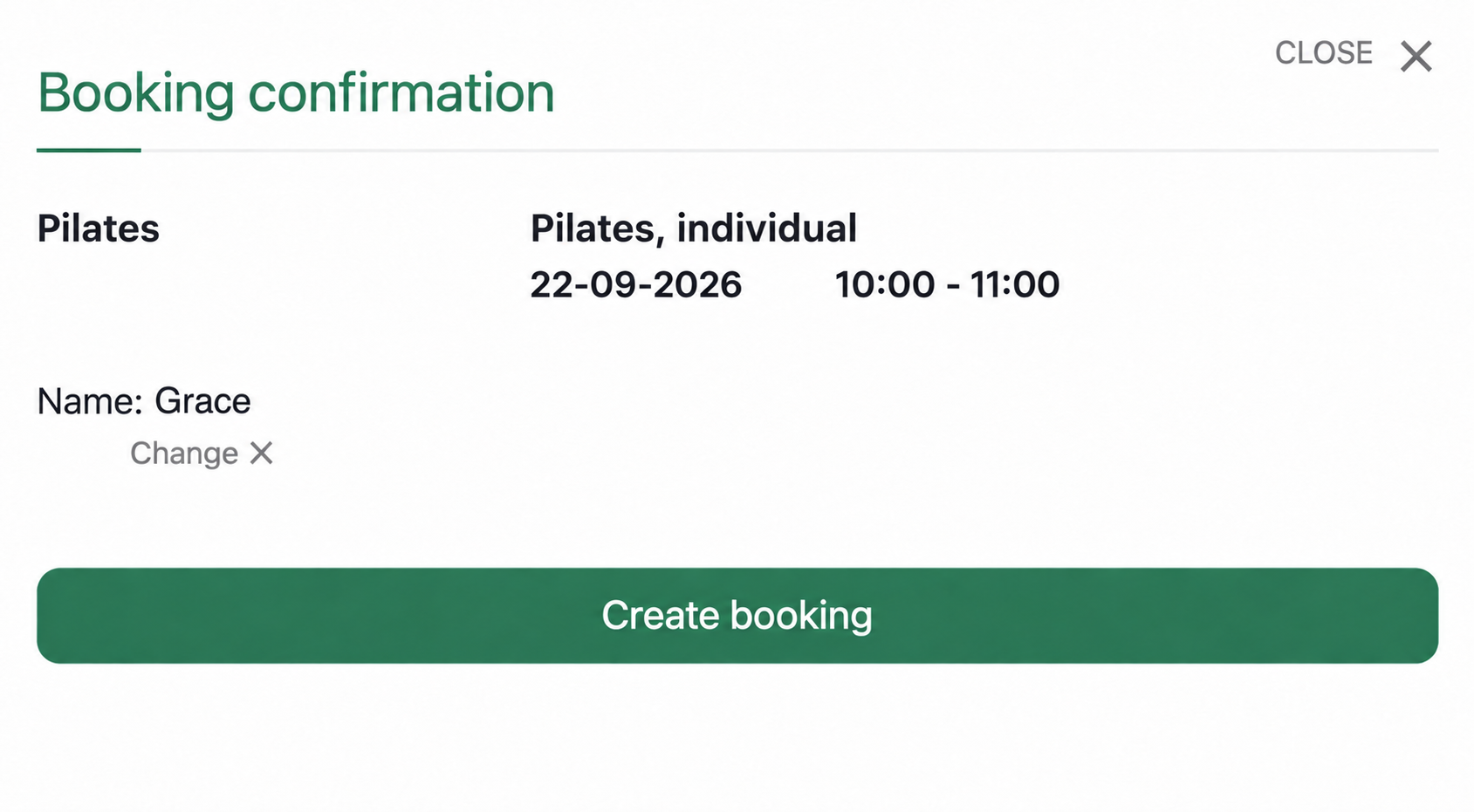
The desktop confirmation window also uses the brand colour:
7. Change the palette using four values
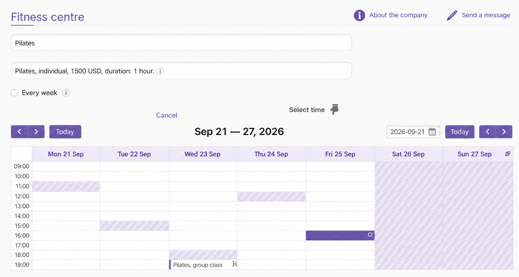
Steps 2 and 3 use the variables from step 1. To change the palette, replace those four declarations.
For example, a purple palette:
--brand: #6a55a8;
--brand-dark: #4f3e85;
--brand-light: #f0ecf8;
--line: #e0d9ef;
Some ready-to-use combinations:
| Palette | --brand |
--brand-dark |
--brand-light |
--line |
|---|---|---|---|---|
| Green | #2f7d5b |
#215c43 |
#e7f2ec |
#d6e3db |
| Purple | #6a55a8 |
#4f3e85 |
#f0ecf8 |
#e0d9ef |
| Ocean blue | #1f5f8b |
#16476a |
#e8f1f8 |
#d4e3ef |
| Terracotta | #b35c3c |
#8c452b |
#f8ece6 |
#ecd8ce |
Choose a main colour with enough contrast for white text. Use a darker version for --brand-dark, a nearly white tint for --brand-light, and a slightly darker border colour for --line.
Copy colour codes from your website design or logo, or use an eyedropper in a graphics editor or browser developer tools.
8. Other customisations
CSS can also change sizes, spacing, fonts and element visibility. For example, hide the Send a message link:
.CompanyIndex .MessageSendButton {
  display: none;
}
To find an element's class, right-click it on the booking page and choose Inspect.
Some useful class names are:
booking-title: company name;booking-action: actions near the top of the page;booking-slot--busy: unavailable time;booking-contacts: contact details.
Contact support if you cannot identify the element you need.
What each block controls
| Change | CSS location | Result |
|---|---|---|
| Brand palette | First four variables in step 1 | Branded headings, links, icons and buttons |
| Unavailable times | Step 2: .EventTypeBusy, .EventTypeOffHours |
Light hatching |
| Client's own bookings | Step 2: selector with 140, 179, 140 |
Solid brand colour |
| Group sessions | Step 2: .EventTypeGroup |
White cards with a coloured border |
| Weekday header and grid | Step 2: .fc-day-header, .fc td |
Pale header and subtle lines |
| Fields and buttons | Step 3 | White rounded fields and rounded buttons |
Quick checklist
- Open Integration → Appearance customisation.
- Paste the code from steps 1, 2 and 3 together.
- Replace the first four colours with your palette.
- Save.
- Check the desktop and mobile booking pages.
- Make sure available and unavailable times are clearly distinguishable.
Things to keep in mind
The stylesheet applies company-wide. All company calendars use it.
The page classes determine the scope. Use .CompanyIndex and .CompanyMobile for client pages, and separate .Timetables rules to style the administrator's calendar.
Check contrast. Darken --line if unavailable-time hatching becomes difficult to distinguish from open slots.
To restore the default appearance, clear the CSS field and save. Keep a copy of your current stylesheet before experimenting.
The field accepts CSS only. Do not paste HTML or JavaScript into it.
Interface updates can change selectors. If a rule stops working, inspect the element again and update the selector.